
Gallery Walls--alternative grids
I'm such a fair-weather friend, aren't I?
Blogging silence. And now, here I am--asking for your help! (Well, opinions anyway.)
I've been in my new office space for over a month and finally finding time to hang art and curtains and generally upgrade the feel of the place.
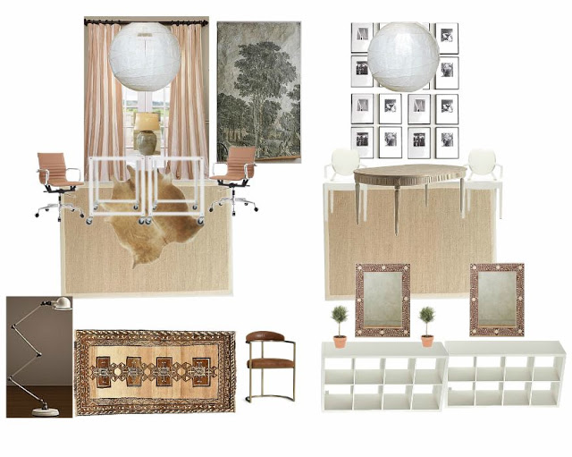
Here's the design board for the general plan:
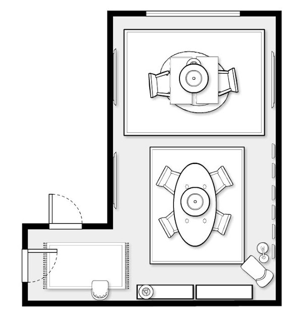
And the floor plan:
That grid of artwork that defines the conference table area is made of these bookplates from a vintage book of world mythology that I found at the Retrowanderlust warehouse sale. (As pictured in my former space, upstairs.)

I have 19 in total, and I came to the office today (Saturday) to hang it in a tall grid of five-five-five-three.
Well, nothing is quite that simple, is it?
I realized that I wasn't sure I wanted such a rigid grid as I had planned. Why? Because I already had a grid of 16 spaces in the expedit bookshelves on the far wall.

So instead of hanging the art, I've been playing around on the computer, deciding on a layout.
Here's where you come in: what's your favorite?
My original plan:
(I wanted something vertical, but am limited by the vertical orientation of the prints and the overall height. 4 rows just fit floor to ceiling, with about 2 inches between frames.)

Other straightforward grids:


But then I started to think about ways to add in more dynamic shapes or movement.
Staggered lines:

Center line with "chevrons":

The checkerboard:

The "Butterfly":

...Those are all still pretty geometric. So what about this?

When I saved the above image, I titled it "breaking free of the grid." I sort of love how it feels like it just got kind of shaken loose.
Okay: VOTE!
Actually, I think this exercise just told me what to do....but I still want your opinion!