
Before and After: Refined Meets Fashion-Forward
I recently learned that our clients bought this gorgeous 1920s home in an auction—online! They bought it as a forever home and a restoration project, knowing they would slowly address all of the issues over time, brining the house back to its full glory.
One of the spaces that was NOT exactly glorious was the kitchen. Renovated at some point (1980s?), there was clearly an effort to tie in to the aesthetic of the house, but the floor plan just wasn’t working.
In partnership with Rehkamp Larson architects, we worked to create much better flow. A thoughtful addition on the back of the house added a much needed mudroom and powder bath, and a window-filled breakfast room connects those space to the renovated kitchen. (Since those spaces are new, there’s no before! For the “after,” check out the project page here.)
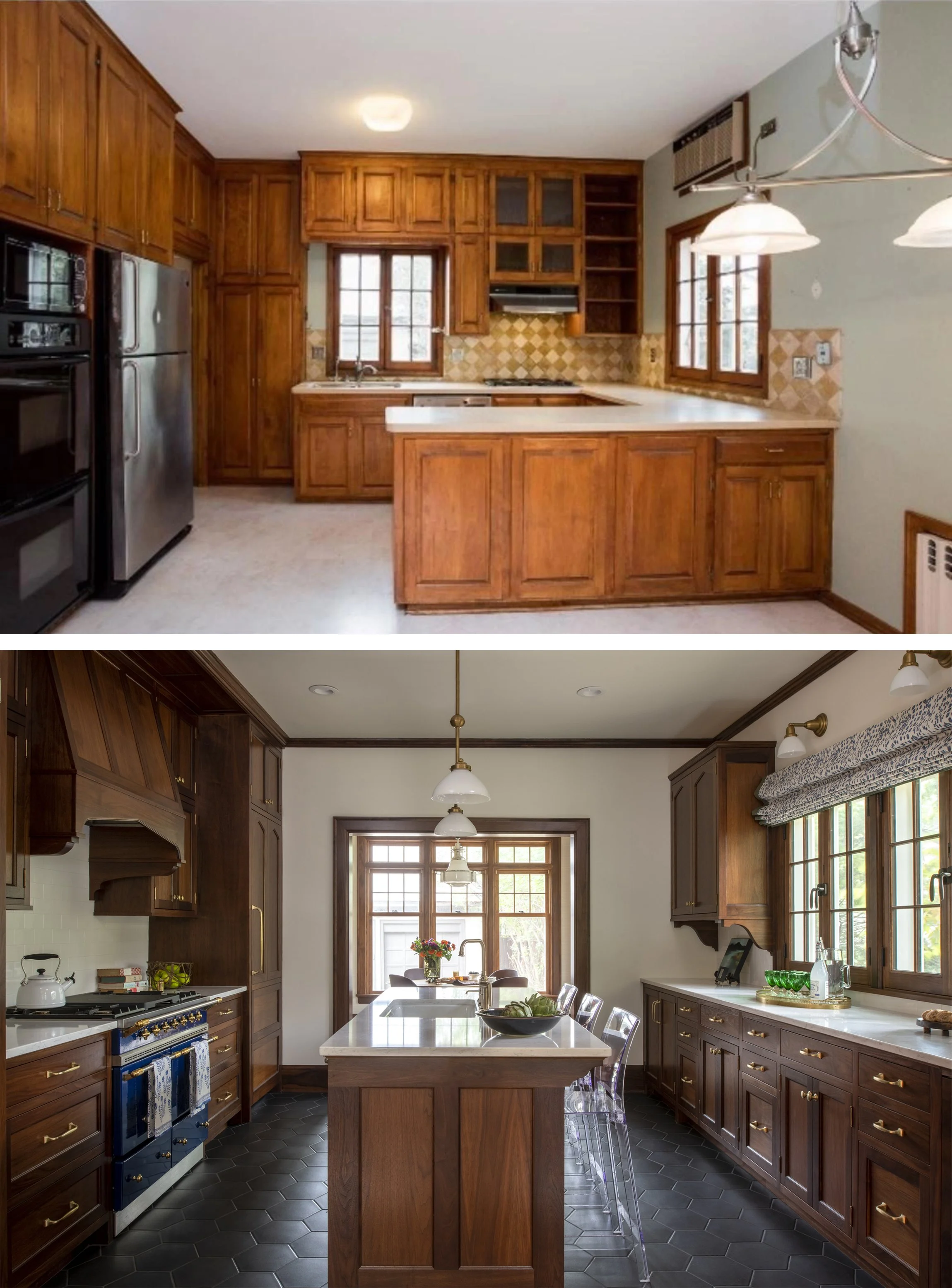
Photo: Scott Amundson
Paired photos above: Same angle. We opened up the back wall to the breakfast room and enlarged the window at right. Swapping the peninsula for an island opened up flow through the space while maintaining an eat-in option.
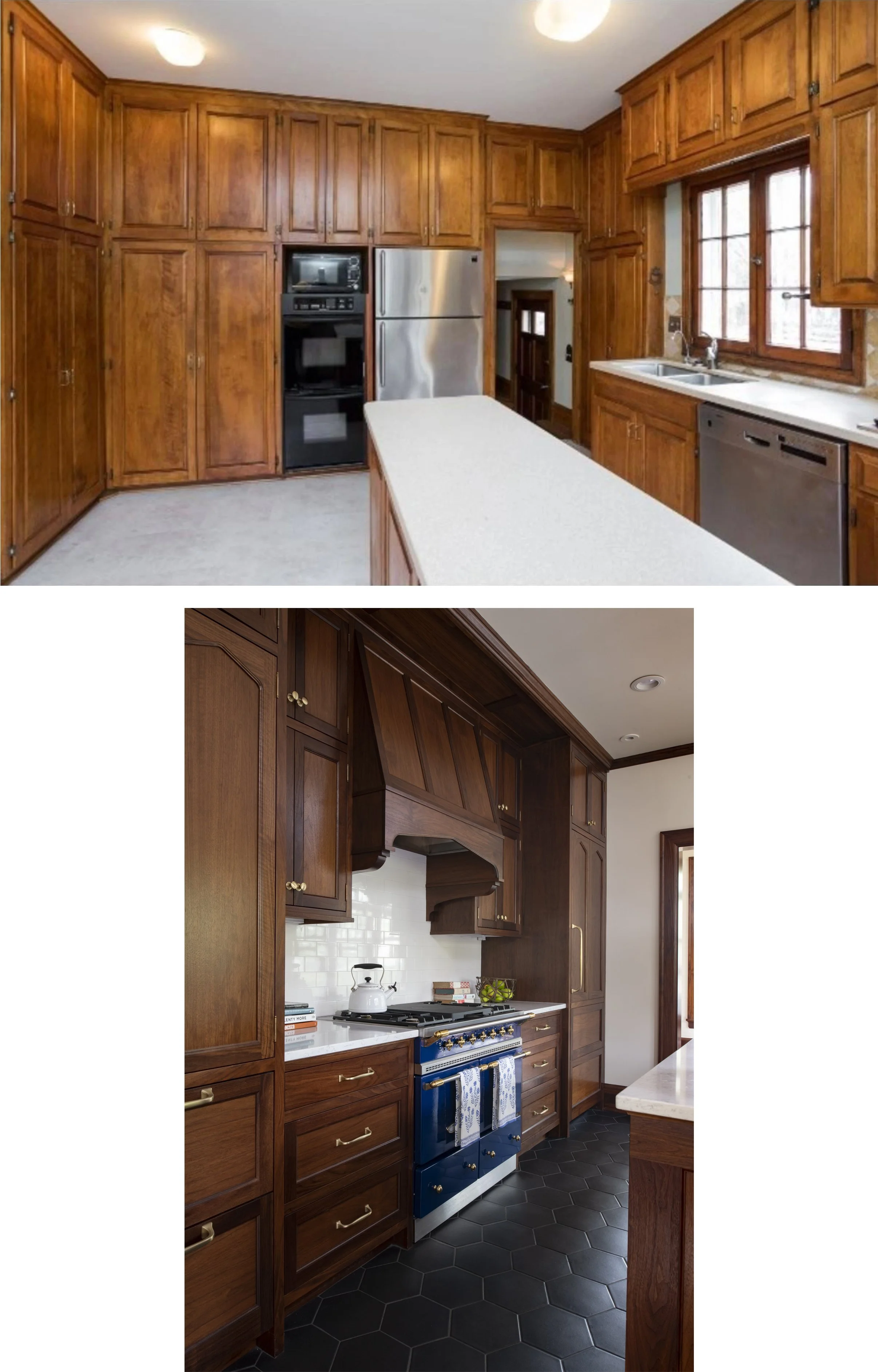
Closing off the door to the back hall (at back left in before photo) and moving that circulation into the breakfast room allowed a symmetrical arrangement on this wall and let the french blue LaCanche range play a starring role.
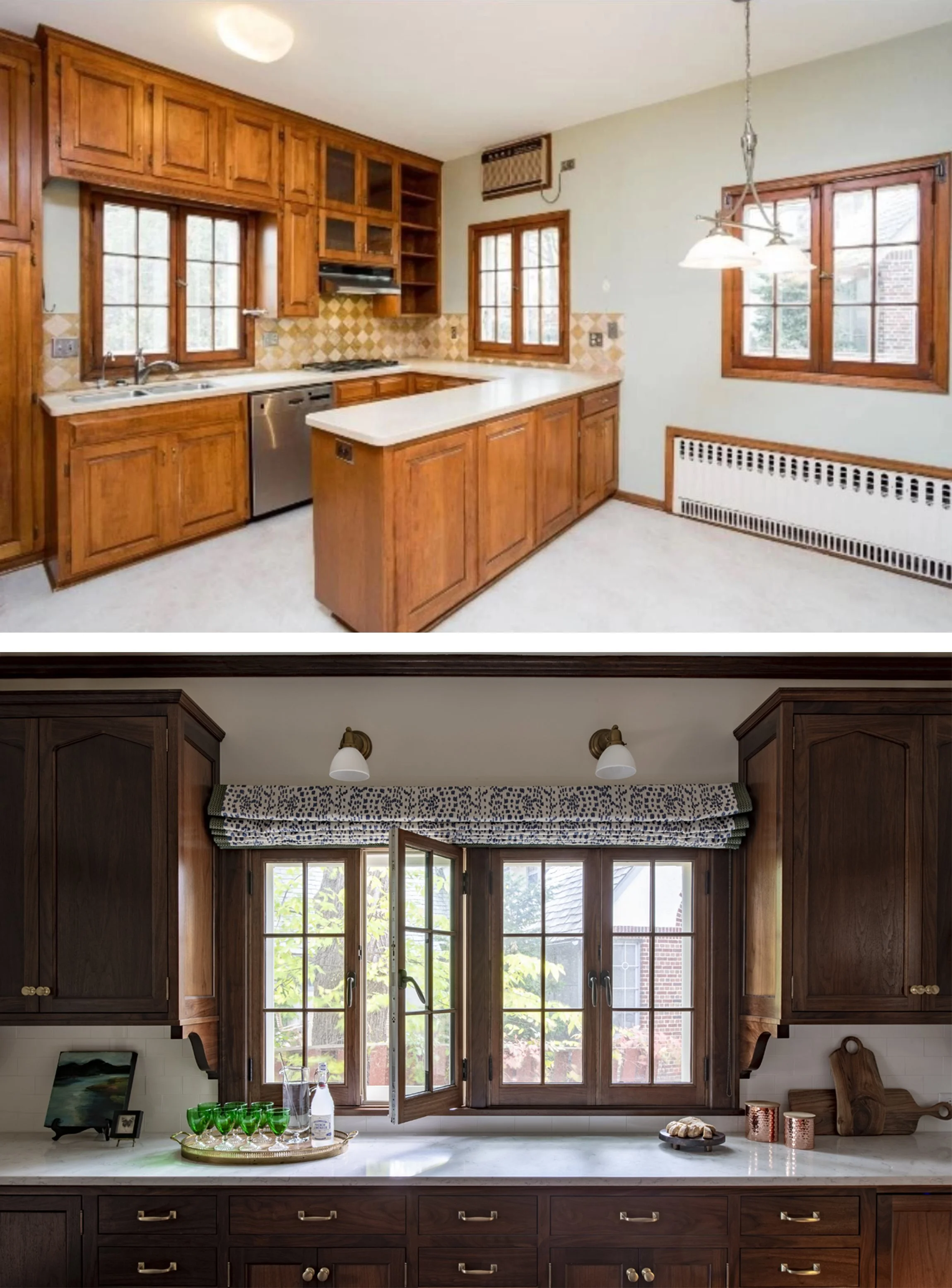
On the facing wall we matched the symmetry with a pair of uppers flanking a pair of windows. The inswing windows are new but every bit as charming as the originals.
Oh, should we talk about the floor? I’d say we gave it an upgrade! From linoleum to hand-made ceramic tile with a slightly metallic glaze; we came a long way.
Next Up
This was phase 2 of this project. Phase 3 is about to kick off with the dining room and kids bath. We can’t wait to continue on the journey with this beautiful house and our lovely clients!