
Making the most of dated tile (sneak peek)
Last week I posted a sneak peek of the guest room I am working on at my parents' house--a room which happened to be my high school bedroom, all decked out in pale green and peach.
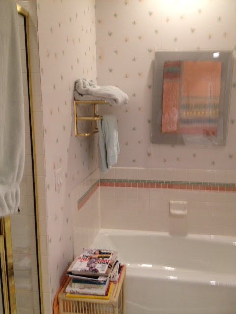
Guess what? There is an ensuite bathroom in peach and green, too. Back in 1990, tinted grout was the latest and greatest, so fast forward a couple of decades and my parents have some seriously dated--and seriously fixed--design choices to contend with.
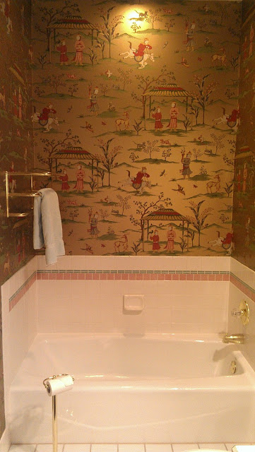
So how do you update a bath with dated colors without ripping it all out?
Wallpaper, of course. We chose a dramatic, look-at-me paper to draw the attention away from, well, everything else. Here's the key: you need to pick up the colors from the tile, but also incorporate other colors from the house. When my parents redecorated other spaces about 10 years ago, they introduced a lot of red, gold and chinoiserie accents, so we found a paper to reflect that. The peach and green in the paper actually make the peach and green tile make sense, and this is gorgeous as it relates to the rest of the house.
Guess what? There is an ensuite bathroom in peach and green, too. Back in 1990, tinted grout was the latest and greatest, so fast forward a couple of decades and my parents have some seriously dated--and seriously fixed--design choices to contend with.
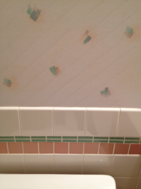
And just in case you're looking at it thinking "That's not so bad..." I give you a close-up.
So how do you update a bath with dated colors without ripping it all out?
Wallpaper, of course. We chose a dramatic, look-at-me paper to draw the attention away from, well, everything else. Here's the key: you need to pick up the colors from the tile, but also incorporate other colors from the house. When my parents redecorated other spaces about 10 years ago, they introduced a lot of red, gold and chinoiserie accents, so we found a paper to reflect that. The peach and green in the paper actually make the peach and green tile make sense, and this is gorgeous as it relates to the rest of the house.
What do you think?
I can't wait to bring in the right towels, bath rug, and accessories to finish it up.