
Contrast back
Have you noticed the interesting trend towards patchwork these days? It feels like I'm seeing a lot of upholstery where every little part is a different fabric or color. Bohemian, I suppose, but a little much for my taste.
A detail of the contrast welt (you know I will never argue with raspberry, cobalt, and chartreuse. No, not ever.)
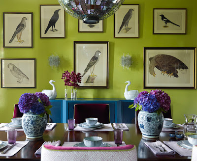
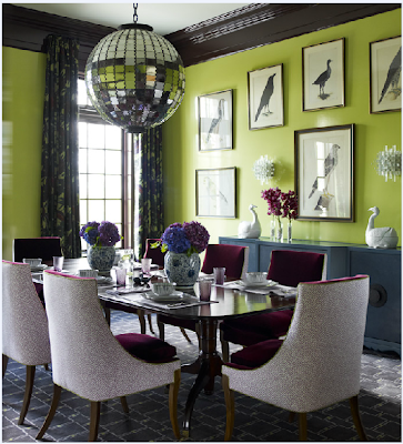
And this pair is fun--same room, different styling. Even the lighting makes a difference, with the top image looking much more contrasty.
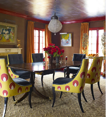
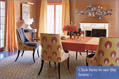
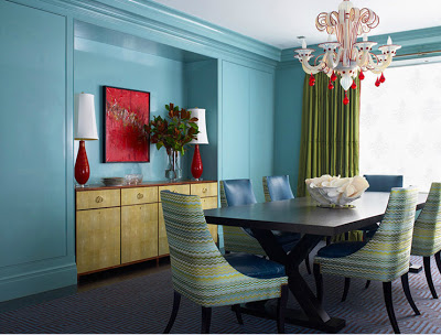
But two fabrics on one piece? That can be perfection. Looking around for some inspiration images for a client, I notice that Katie Ridder is the master of the two-tone dining chair. Check it out:
A detail of the contrast welt (you know I will never argue with raspberry, cobalt, and chartreuse. No, not ever.)
What do you think? Would you pair a contrast fabric on the back of your dining chairs?
Photos: katieridder.com