
Before and After: York Avenue South
This project was actually completed early last year and photographed in May 2018. Since I knew it was coming out in print I held back on sharing the before and afters. I’m excited to share now though, because it is such a great lesson in making something your own!
I went to see the house with my clients before they bought it because they wanted ideas on how to re-conceive the spaces to better suit their needs. (Sellers were empty nesters, my clients have two school-aged kids.)
The main living space is one long room, off the entry and kitchen, which was previously set up to have a small sitting room in the front and a large dining room in the back. We ultimately flipped that to give more space to lounging, and to make the living room more private.
Here come the before and afters!
Most of the before shots are from the real estate listing (bad phone pics are called out too). The afters are all spacecrafting.

Before, looking to the back

After: We put the living room here, where it is more private with no direct view from the street

Before: The front of the room, used as a small sitting room.

After: The space works well as a dining room. I always love a fireplace in a dining space!

After: We also treated the windows as two units, each with a pair of drapes, instead of framing the entire wall with two panels. I love the sliver of wall leftover, perfect for a stack of prints picked up on a vacation.

Before: crappy phone pic, but it shows how you look in to the kitchen from the living room

After. It’s okay to have the furniture sit in front of an architectural feature like that archway, as long as there is ample clearance for a walkway. This allowed the room to feel much bigger.

Before: The entry just needed a little bit of layering.

After: The large artwork on the landing came from the client’s previous home and set the direction of the color palette. We added carpet wherever possible for sound absorption and soft landings. I love the kid art that we hung on the lower landing, and how the existing entry light feels like we chose it for this space!

Before: This space, connected to both living and dining by double pocket doors, formerly served as a TV room. We made it a multi-purpose office/ homework/ hang out space, which provides additional seating for entertaining as well.

After: This wallpaper is the first thing the client fell for, and boy does it make a big impact in this small space!

Before: The kitchen was just fine, with some interesting architectural details, but for my clients it was missing something: COLOR!
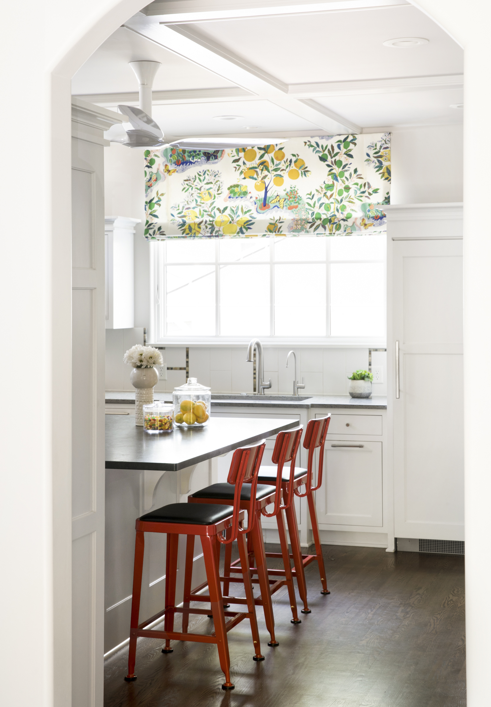
After: We added a roman shade in a classic Josef Frank print from Schumacher and a major color pop with indestructible red metal and black vinyl barstools from Industry West. Those two changes transform the room.

Before: In the bedroom, we kept the basic layout but added wall to wall carpet, which calmed the space down. The wood floors were a different species from the hallway and very busy. Grey wool carpeting is soothing.

After: We added height with the upholstered headboard and brought in more substantial nightstands for balance.
I love how this space was utterly transformed with zero construction, and I always love to work with clients who go for it with the color and bold elements!